Stop and Breathe
Team: Group of 8
Role: Game Designer, Level Designer
Timeline: 8 Months
DESCRIPTION
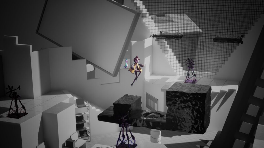
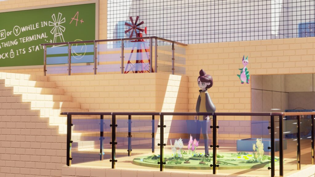
Stop and Breathe is a 3D Puzzle Platformer designed to teach a research-backed breathing technique to teens to help tackle and prevent anxiety attacks. My capstone team and I worked alongside a professor from Sheridan’s Child and Youth Care program during this year-long project, as we all had a passion for creating games for change. I worked as a game and level designer, creating levels and mechanics that encouraged breathing and rewarded learning with unique and memorable interactions.
TOOLS
- Unreal Engine 5
- Unreal Blueprints
- Maya
- Miro
- ClickUp
PROJECT OVERVIEW
You can also download and play Stop and Breathe on Steam:
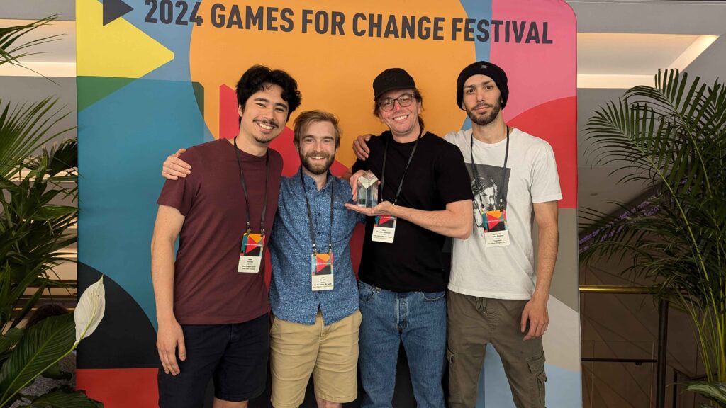
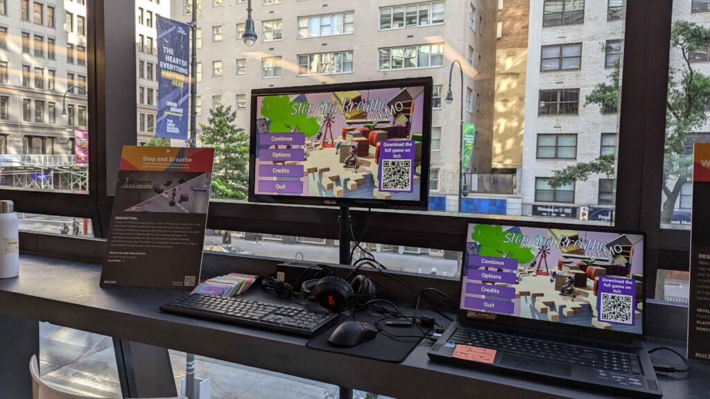
AWARDS AND SHOWCASES
SERIOUS PLAY CONFERENCE
2024 PROGRAM
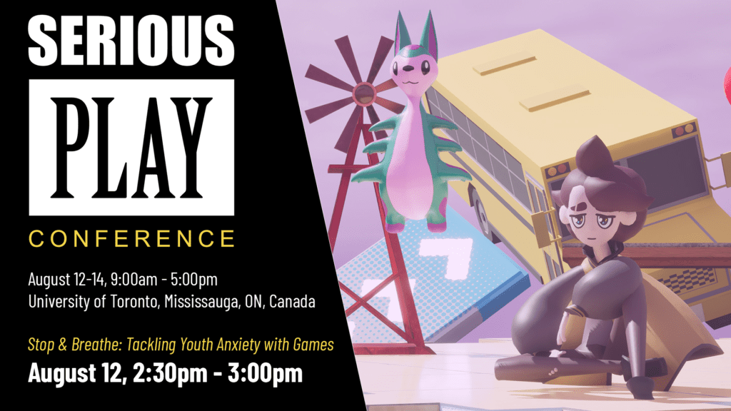
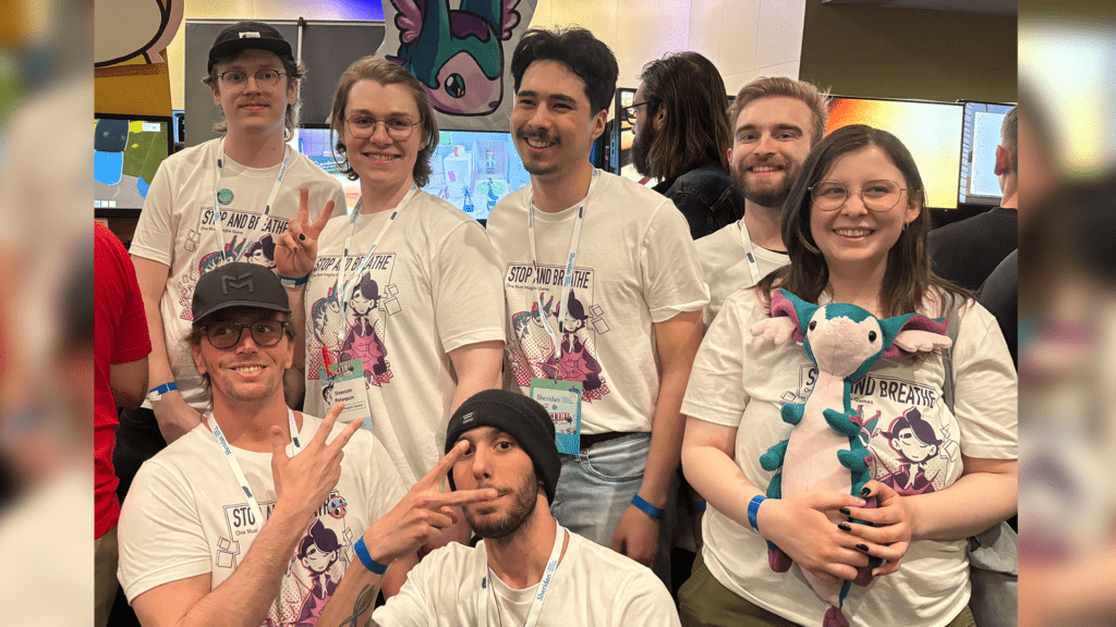
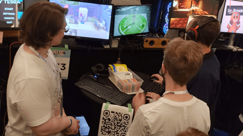
My team showcased Stop and Breathe in a presentation at the 2024 Serious Play Conference, in Toronto, Ontario.
During the presentation my capstone team and I shared design problems we overcame and insights we learned when designing an educational game that teaches breathing techniques to teens.
LEVEL DESIGN
LEVELS OVERVIEW
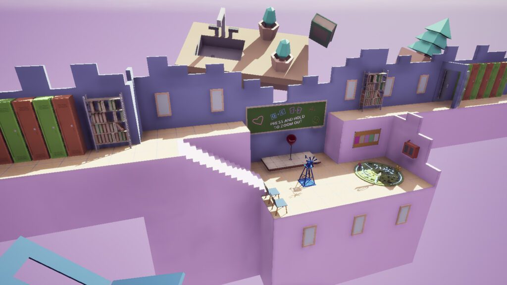
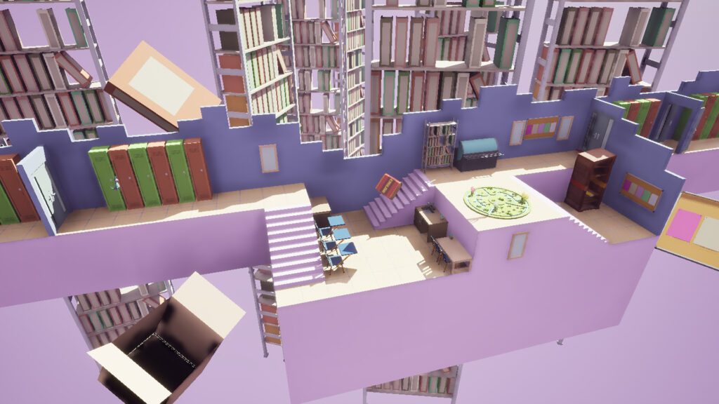
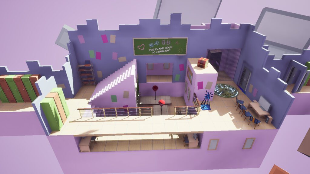
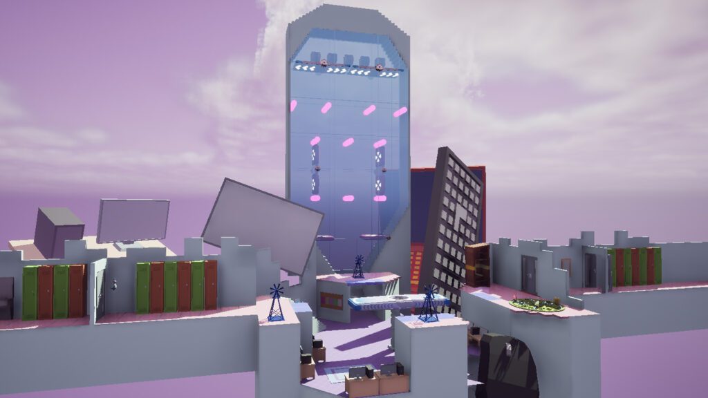
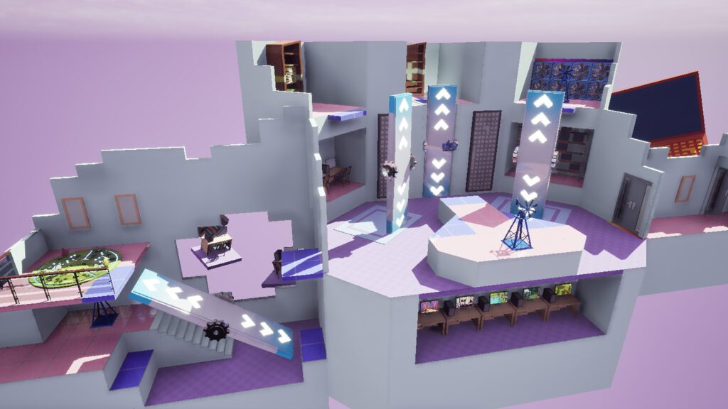
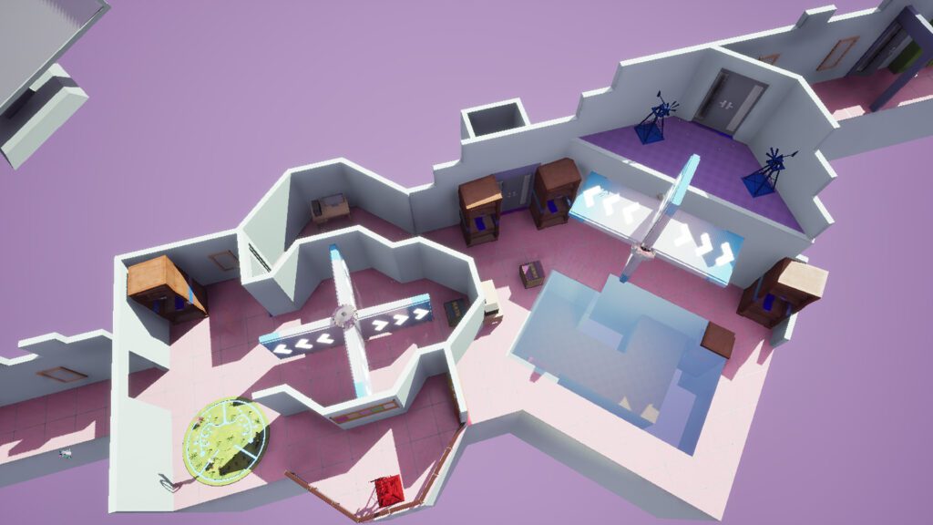
Stop and Breathe features an introductory chase scene alongside 4 levels that contain 3 puzzles each.
I was responsible for designing levels 1 and 3:
INTRO
Overall Difficulty:

LEVEL 2
Overall Difficulty:

LEVEL 3
Taught Mechanics


LEVEL 4
Overall Difficulty:

TEACH, THEN TEST
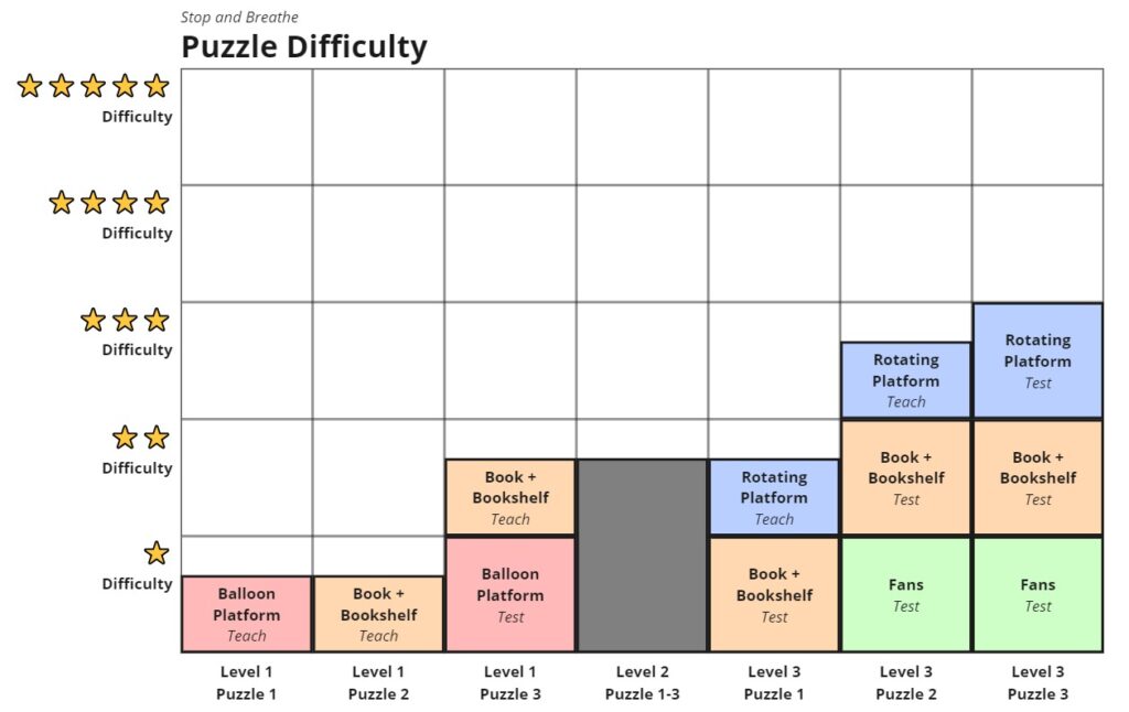
Stop and Breathe was designed to be as accessible as possible. New mechanics are first taught in a safe and isolated environment before the player is tested.
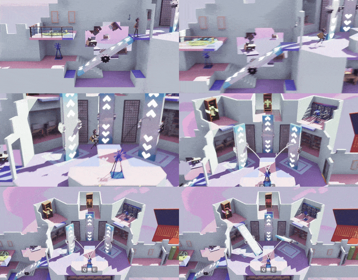
In Level 1 Puzzle 1, Balloon Platforms are introduced in their simplest form with no additional mechanics. Puzzle 2 does the same with Books and Bookshelves.
Puzzle 3 finally combines the two, testing what the player has learned. This design approach lets anyone enjoy the game, no matter their age or skill level.
UNIQUE INTERACTIONS AS REWARDS
Stop and Breathe doesn’t feature any collectibles, so I designed my levels to use unique interactions as a reward for progressing and learning breathing techniques instead.
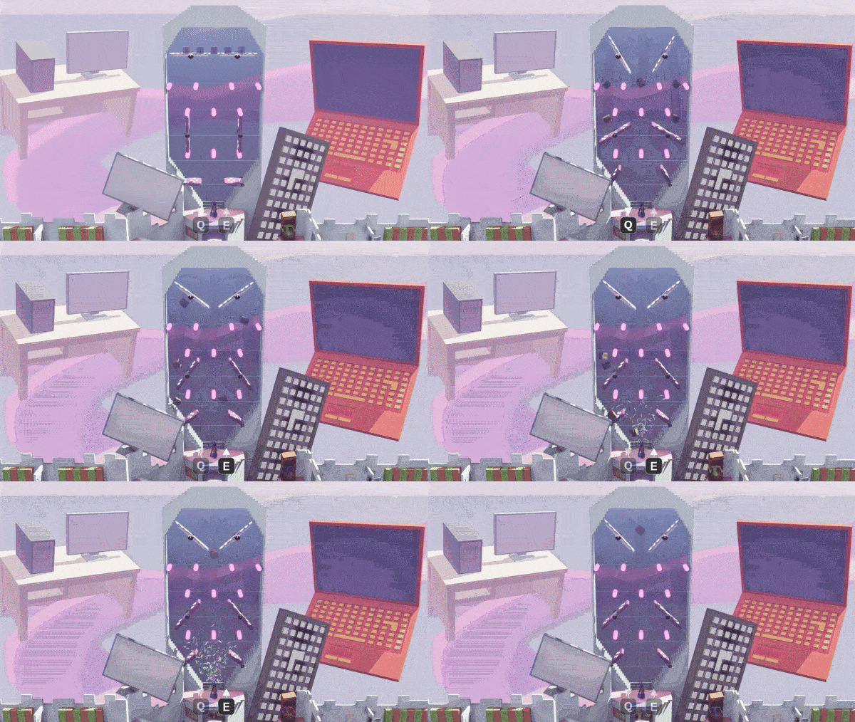
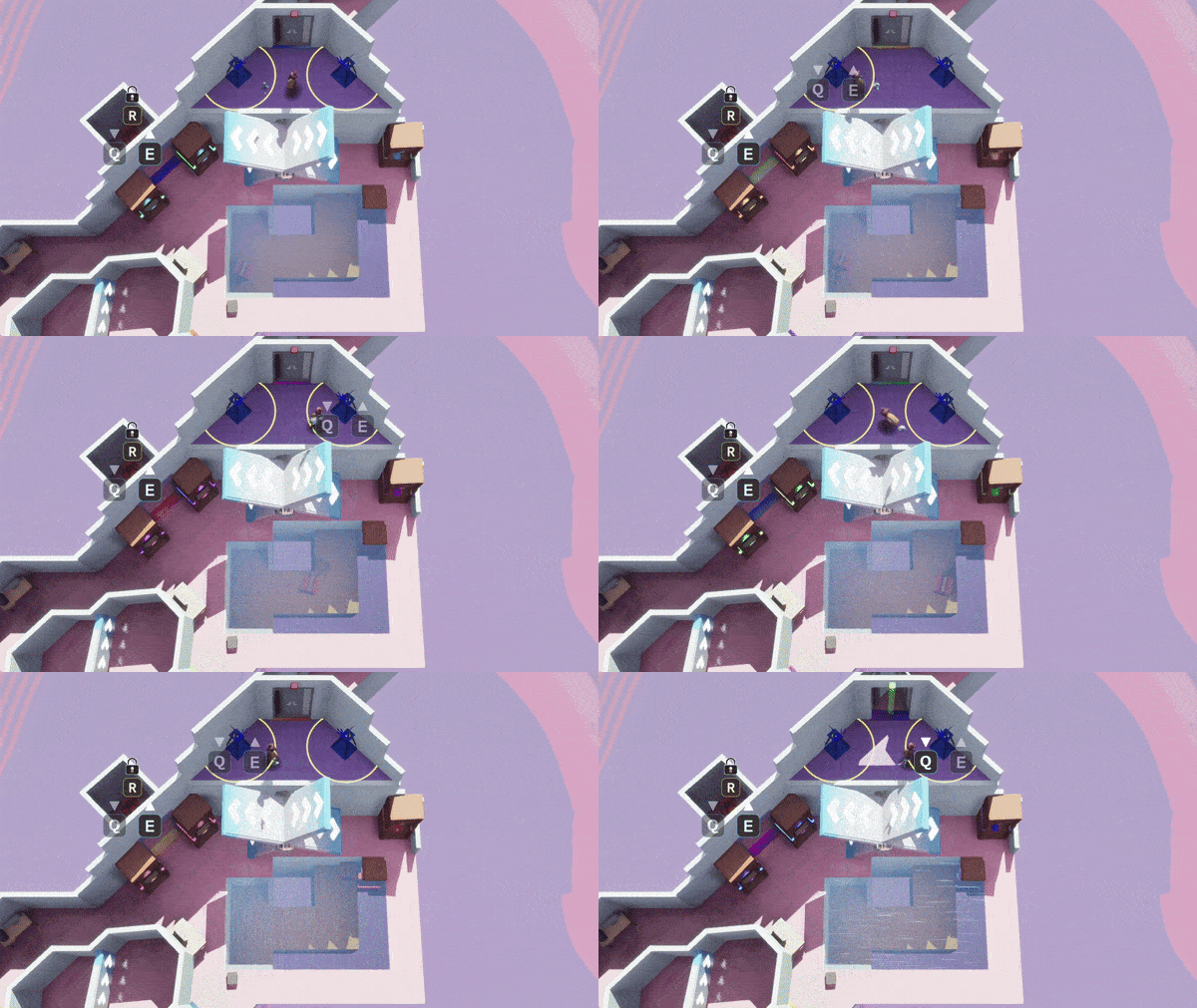
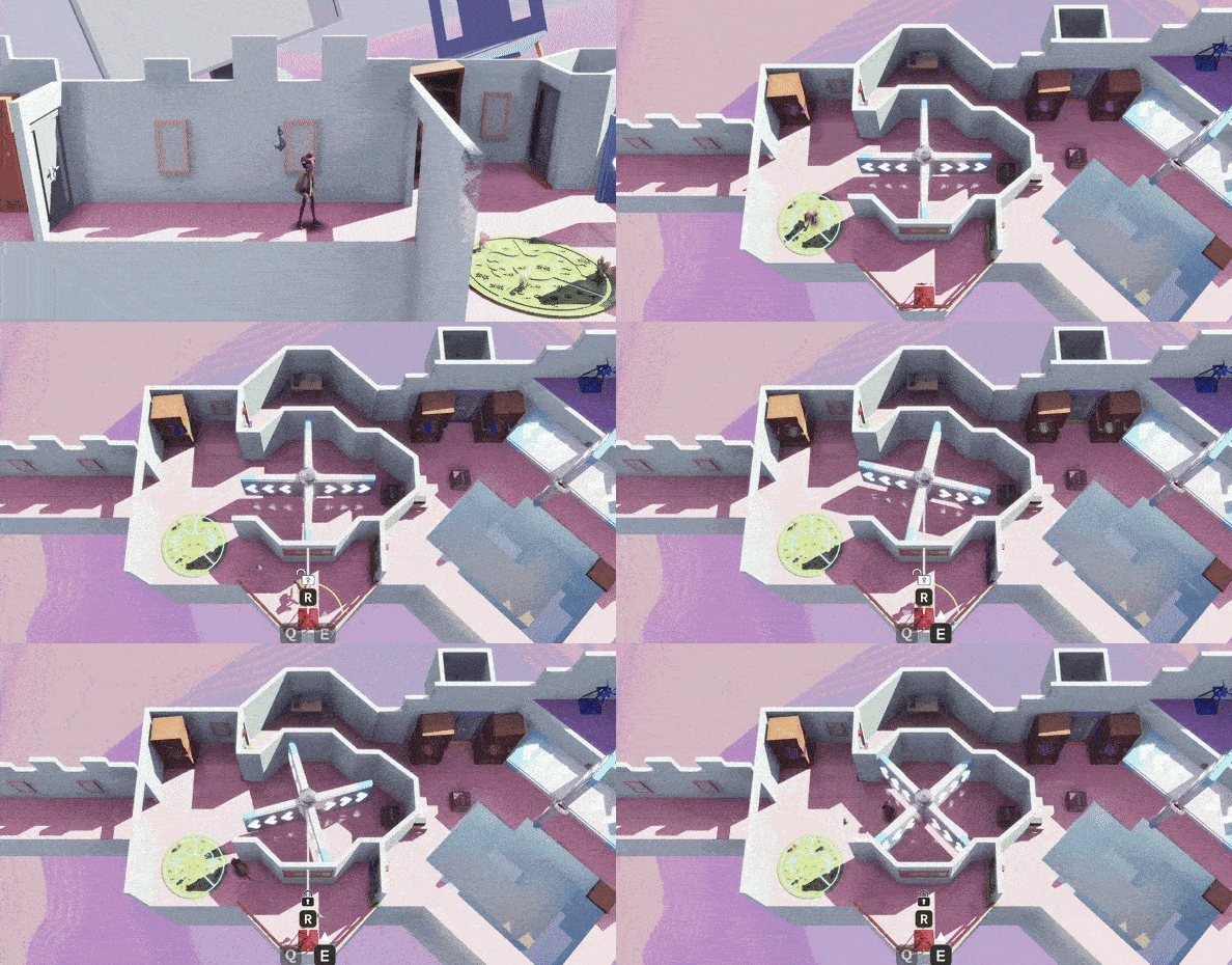
Level 3 Puzzle 1 ends with a giant plinko machine where players must use rotating platforms to bounce books to the chute at the bottom. Puzzle 3 ends with a golf-like game where players use fans to push a book into a bookshelf, avoid pits along the way.
Both segments reuse existing mechanics in new and creative ways and don’t seek to excessively challenge the player. This rewards the player with a cathartic and memorable end to each puzzle.
PLAYER METRICS AND
MODULAR KITS
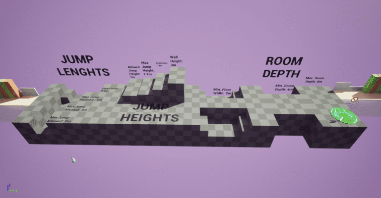
Early level prototypes didn’t follow any standard metrics. This led to spaces feeling inconsistent in scale across levels.
To solve this, I created a metrics gym that outlined standard room sizes, jump lengths, jump heights, jump dead zones, and wall heights.
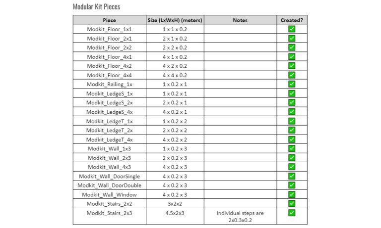
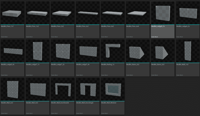
I also created a modular greybox kit that followed these metrics. This let us quickly and easily design levels that adhered to the newly outlined metrics.
You can read more about my design process in this case study.
CAMERA VOLUMES
Stop and Breathe’s default camera follows the player from a fixed angle and distance, but volumes can be used in levels to override this, instead moving the camera to a pre-set position.
I used this to add variety in otherwise mechanically-similar levels, and to highlight key puzzle elements that would otherwise be off-screen.
Level 3 Puzzle 3 heavily uses a top-down camera angle, giving it a unique identity from all previous puzzles. Level 3 Puzzle 2 uses a large zoom-out in the puzzle’s main room, making it easier to create a mental-model of all the puzzle’s pieces.
TAKE AWAYS
Working with other level designers introduced new design challenges I hadn’t previously encountered. My levels had to not only be consistent in style and difficulty with each other, but also the levels of others. Modular kit pieces, player and level metrics, and beat diagrams helped with creating this uniformity.
GAME DESIGN
LIFE BREATHING INPUTS
Life Breathing is the core mechanic in our game that teaches the player proper breathing technique. This meant it had to be intuitive and satisfying while not detracting from the player’s actual breathing.
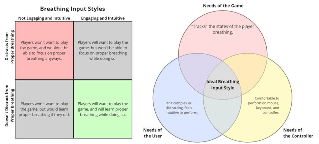
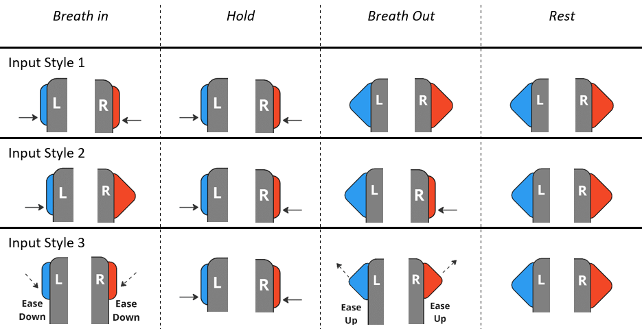
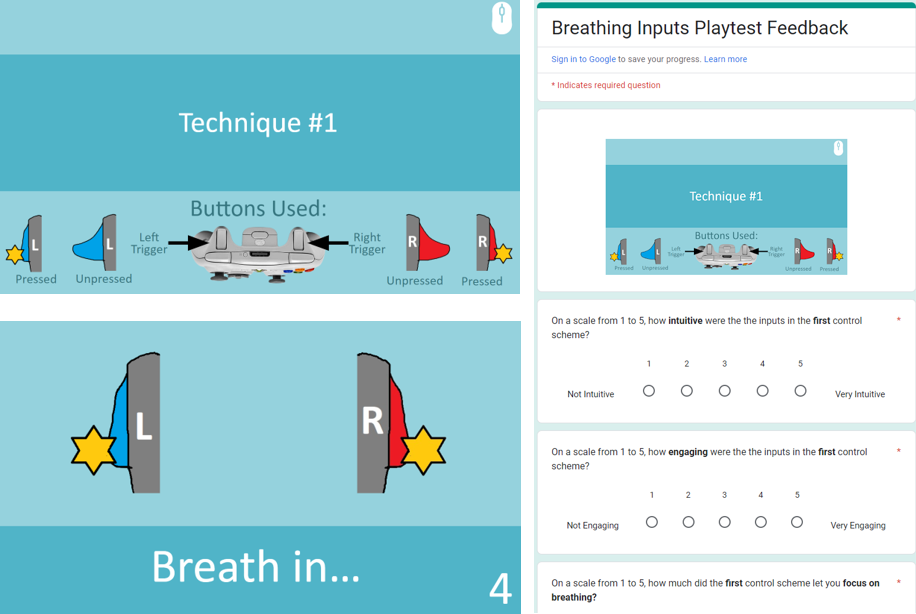
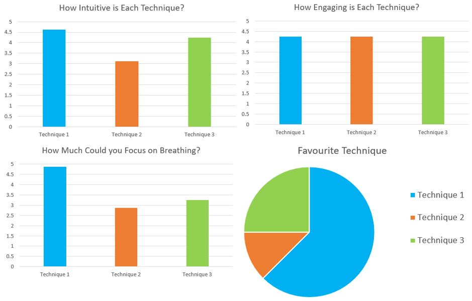
To achieve this, I rapidly prototyped three breathing input styles using a timed PowerPoint slide deck. I then tested it with members of the public, recording the feedback from each during the test and in a post-test survey.
Tracked metrics included intuitiveness, engagement, and the ability not to distract from breathing.
You can read through the full playtest report here.
BREATHING TERMINALS
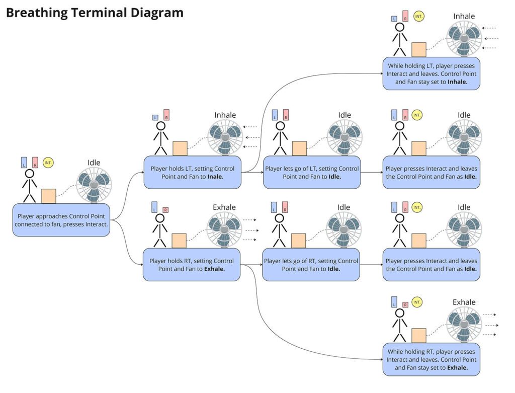
Breathing Terminals let the player interact with puzzle elements like fans, balloons, and rotating platforms.
While they don’t require actual timed breathing to use, we still designed the inputs and visuals to be reminiscent of breathing, keeping our game’s message in the player’s head.
This meant each puzzle object needed three states: inhaling, resting, and exhaling. I created this diagram during development to help communicate this design principal to the team.
BALLOON PLATFORM ITERATIONS
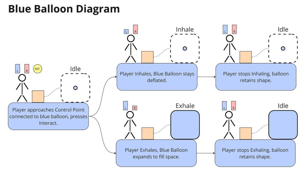
Early on we decided on balloons being a puzzle mechanic as they connect nicely to the theme of breathing. It took many iterations to decide what balloons did though.
I created multiple design pitches for how the balloon mechanic could work throughout development. One idea involved the companion character Zen becoming a balloon, letting the player glide across gaps.
Only the red balloon platform made it into the game, however I also designed and pitched a blue balloon during development. This balloon would expand and contract creating platforms, however it was cut due to development time.
TAKE AWAYS
Documenting and “locking in” game design decisions is crucial during the early stages of development. Our team planned extensively during the start of the project but sometimes failed to make a clear decision before concluding a discussion. This slowed down the whole development process, delaying our entry into Unreal Engine.
ANIMATION AND EFFECTS
CHARACTER ANIMATIONS
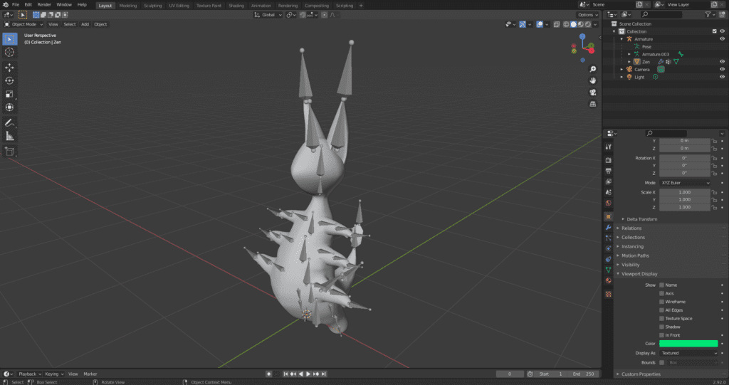
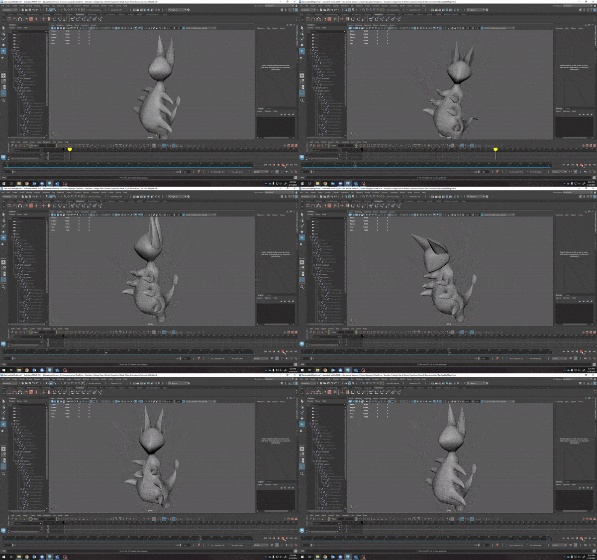
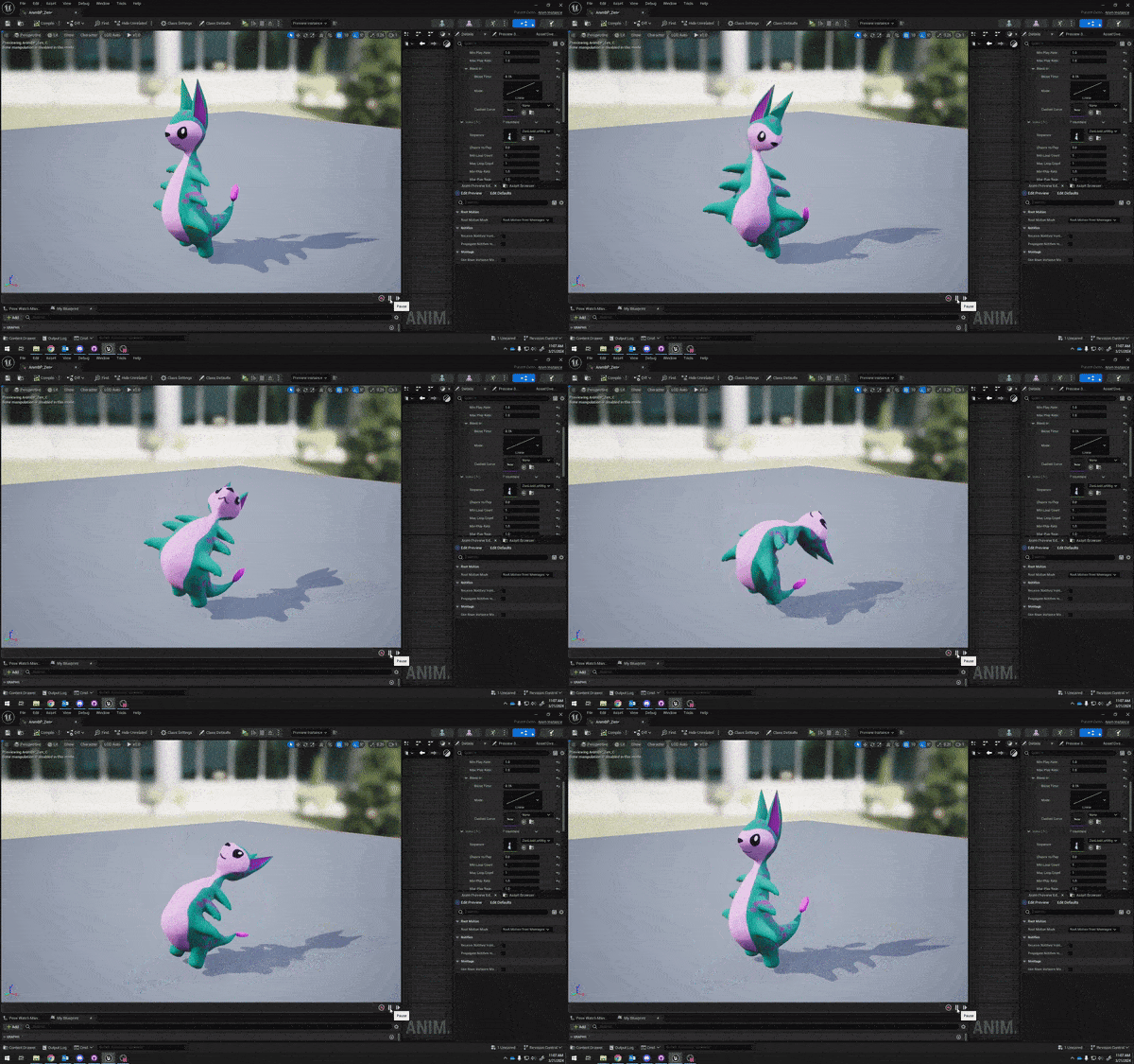
I was responsible for creating the rig and animations for the companion character Zen.
Zen was designed to be a comfort “plush” character for the player, and so I leaned heavily into cats and dogs for my inspiration.
I also heavily exaggerated Zen’s movements, stretching bones past “realistic” distances. This was done to make Zen’s movements more readable, as they only take up a small portion of the screen during gameplay.
ANXIETY BURST
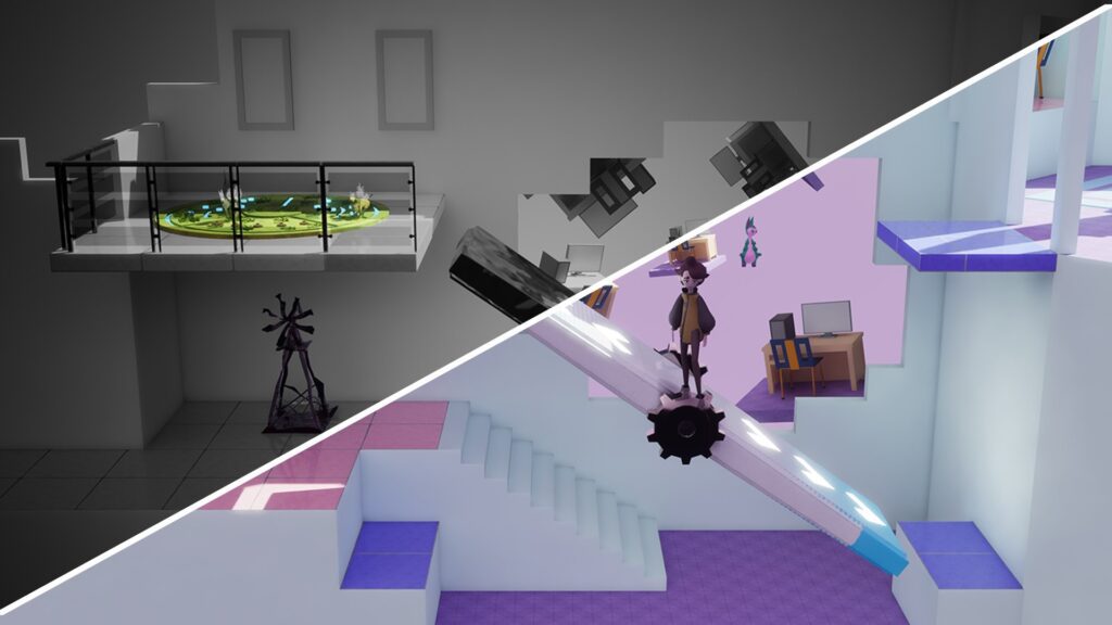
A common critique we received in the send half of our game’s development was that the difference between the anxiety-filled A phase and peaceful B phase of our game levels didn’t feel that impactful.
We were too far in development to make a system overhaul, and so I used extra effects to mitigate this problem.
I added a punchy sound and explosive particle effect to anxiety blockers when they’re destroyed, making the transition between the A phase and B phase feel more impactful.
TAKE AWAYS
Animations and special effects can be a great way to add impact to a mechanic that feels like it’s missing consequence. In later stags of development, this can be a more practical alternative to a mechanic or system overhaul.
More info coming soon!
TOPIC
Lorem ipsum dolor sit amet, consectetur adipiscing elit. Ut elit tellus, luctus nec ullamcorper mattis, pulvinar dapibus leo. Lorem ipsum dolor sit amet, consectetur adipiscing elit. Ut elit tellus, luctus nec ullamcorper mattis, pulvinar dapibus leo. Lorem ipsum dolor sit amet, consectetur adipiscing elit. Lorem ipsum dolor sit amet, consectetur adipiscing elit.
Ut elit tellus, luctus nec ullamcorper mattis, pulvinar dapibus leo. Lorem ipsum dolor sit amet, consectetur adipiscing elit. Ut elit tellus, luctus nec ullamcorper mattis, pulvinar dapibus leo.


 Balloon Platforms
 Books + Book Shelves