True Yaran Theatre
UBISOFT NEXT 2024 - TOP 10
Team: Solo
Role: Level Designer
Timeline: 3 Months
DESCRIPTION
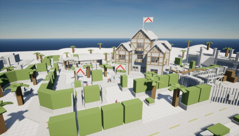
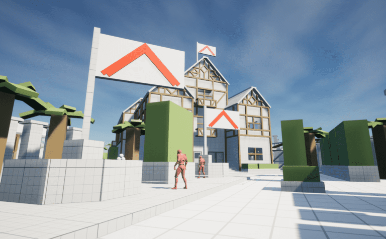
True Yaran Theatre is a 360 degree approach Far Cry style level created in Unreal Engine. The level was created for Ubisoft NEXT 2024’s Level Design category, and placed in the top 10. You play as a rebel who disrupts a corrupt dictator’s planned speech by breaking into the True Yaran Theatre, swapping out their script for your own, and getting out.
TOOLS
- Unreal Engine
- UE Blueprints
- Modular Kit Pieces
- Adobe Illustrator
JUMP TO SECTION
PROJECT SHOWCASE
You can also play True Yaran Theatre on itch.io:
PHASE I - MISSION DESIGN DOCUMENT
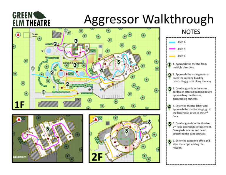
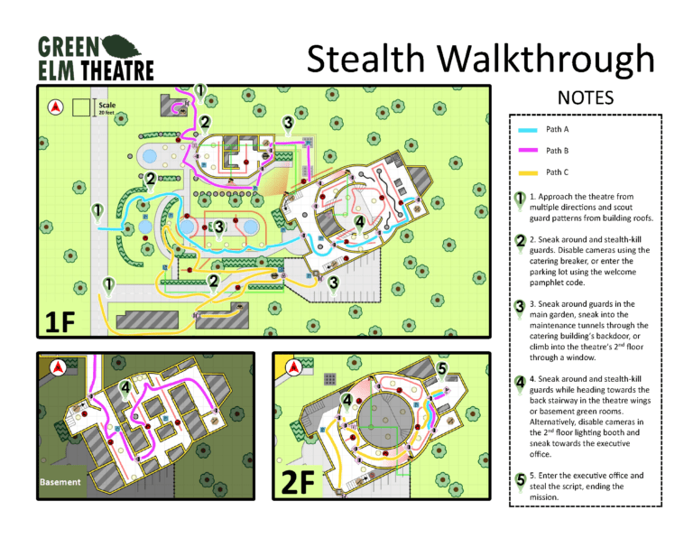
In Phase I of the competition I was tasked with creating a Mission Design Document. This document outlined the narrative, map, paths of play, and location references at a high level.
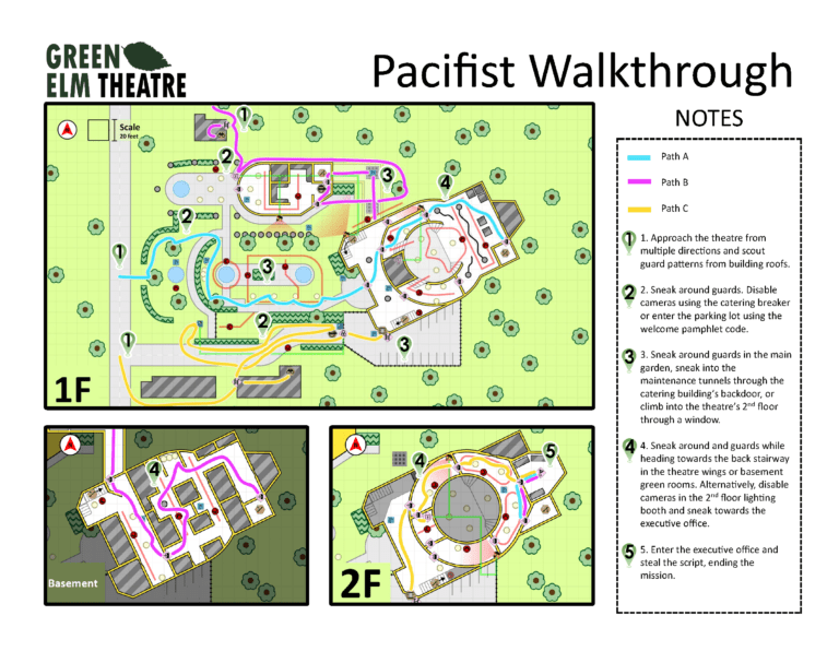
PATHS OF PLAY
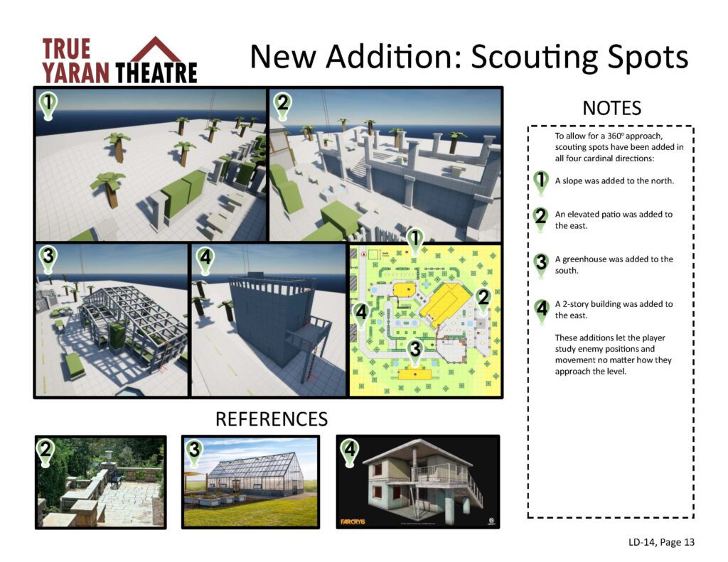
The level was designed to accommodate approaches from a 360 degree angle, and therefore entrances into the theatre grounds were added on most sides of the level.
Multiple sub-paths within these approaches were also designed to suit different styles of play (aggressor, stealth, pacifist).
This was done to give the player agency in how they tackle the mission, letting them adjust their playthrough to their taste.
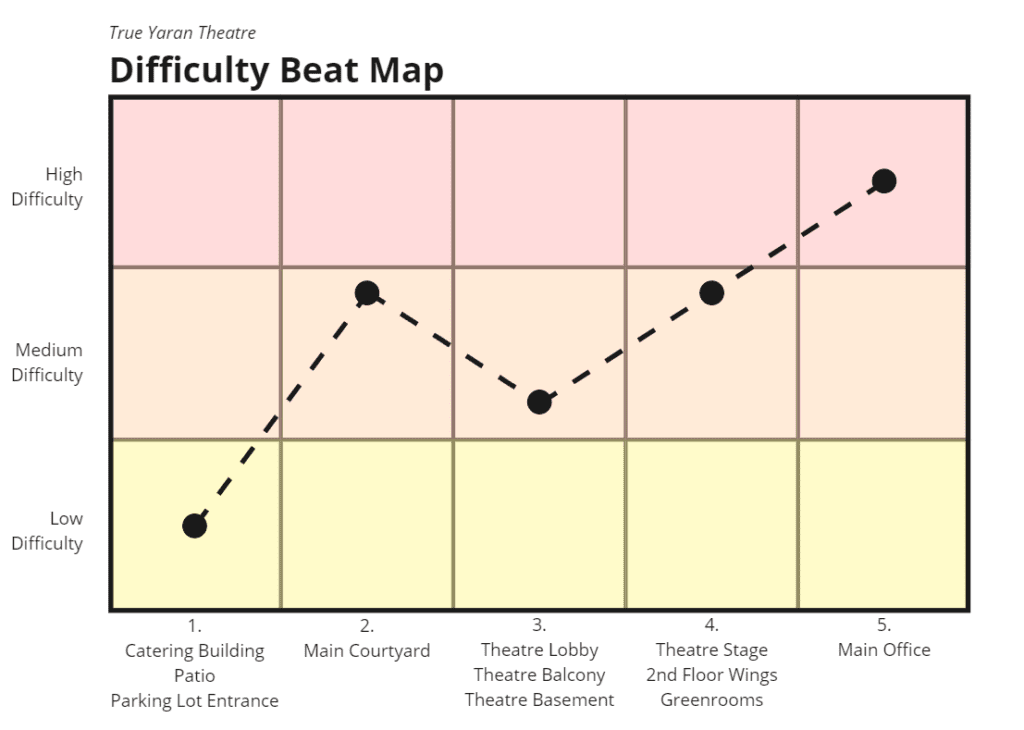
PACING
The level was also designed so that the player would experience a steady climb in difficulty towards two peaks, with a rest point in the middle.
As the player enters the level, difficulty increases the closer they get to the garden’s center, before peaking in the main courtyard. The difficulty then drops in the theatre lobby, giving the player a chance to breathe before they make a final push towards the theatre’s main office.
This beat map then plays in reverse as the player escapes the theatre.
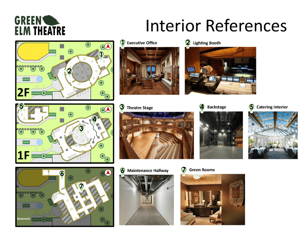
LANDMARKS
The choice of a garden and theatre as a level location was intentional, as they’re both interesting, commonly understood, and feature a wide array of unique landmarks.
Distinct landmarks were included throughout the level to help orient and guide the player.
These include a main courtyard, catering building, parking lot, lobby, stage, lighting booth, green rooms, and a backstage area.
PHASE I DOCUMENT TAKE AWAYS
The biggest takeaway from my Mission Design Document was the importance of designing around multiple player paths early on. Doing so made my final level feel more organic and intentional. While I successfully accommodated multiple approach angles in my original Mission Design Document, I went further with this idea in my Phase II Changelist.
PHASE II - CHANGELIST
In Phase II I was tasked with creating a Greybox of my level alongside a Changelist. The Changelist documented any updates made to the level during phase II along with the reasoning why.
MAP SCALE
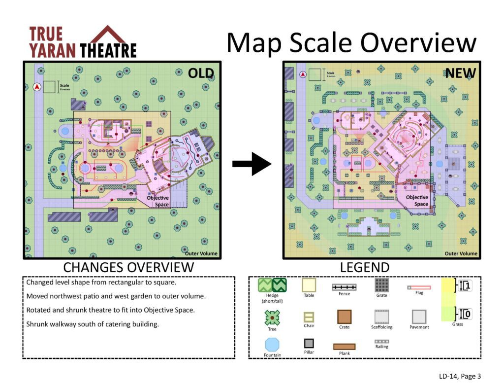
A new constraint was added in phase II of the competition, requiring the final level to fit within a 64m x 64m area, with an outer 128m x 128m area allotted for scouting and aesthetic purposes.
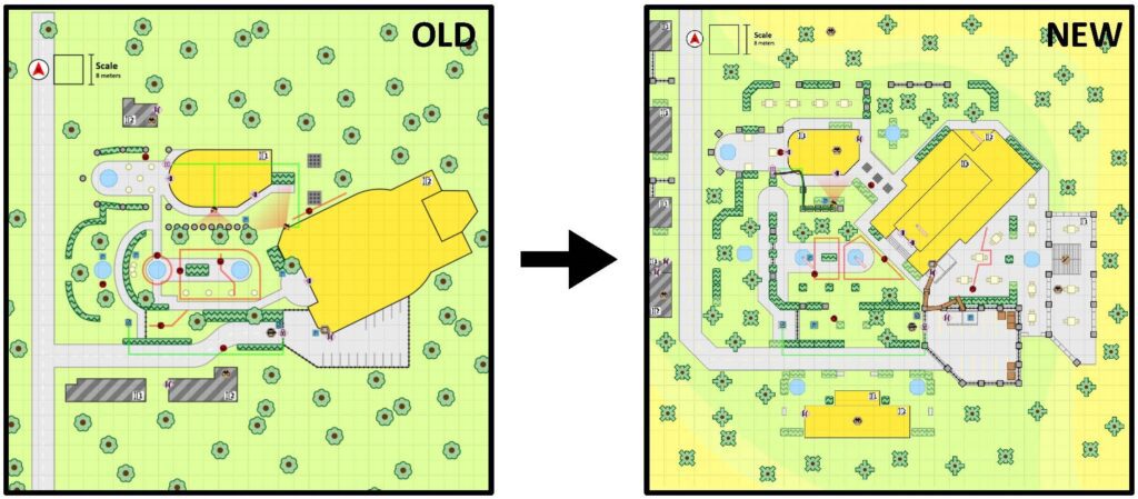
To accommodate this change, areas such as the theatre, main courtyard, and catering building were shrunk and moved closer to the center of the map. Areas such as the northwest patio and west garden were also moved into the outer volume to make room for more central areas.
NEW APPROACH ANGLE: PATIO
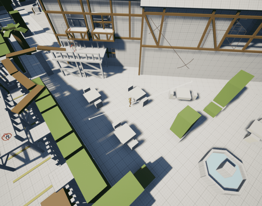
The map’s first iteration lacked a way to enter the level from the east. To better support 360 degree approaches, a patio was added between the theatre and parking lot, creating an entrance into the level.
A stealth path existed where the player could climb a ladder in the parking lot directly up to a theatre window, and so scaffolding was added to bridge the gap that the patio created.
GUIDING LANDMARKS
As I iterated on my level, I came up with more opportunities for unique landmarks that could create more interesting and varied paths, while also helping the player orient themselves.
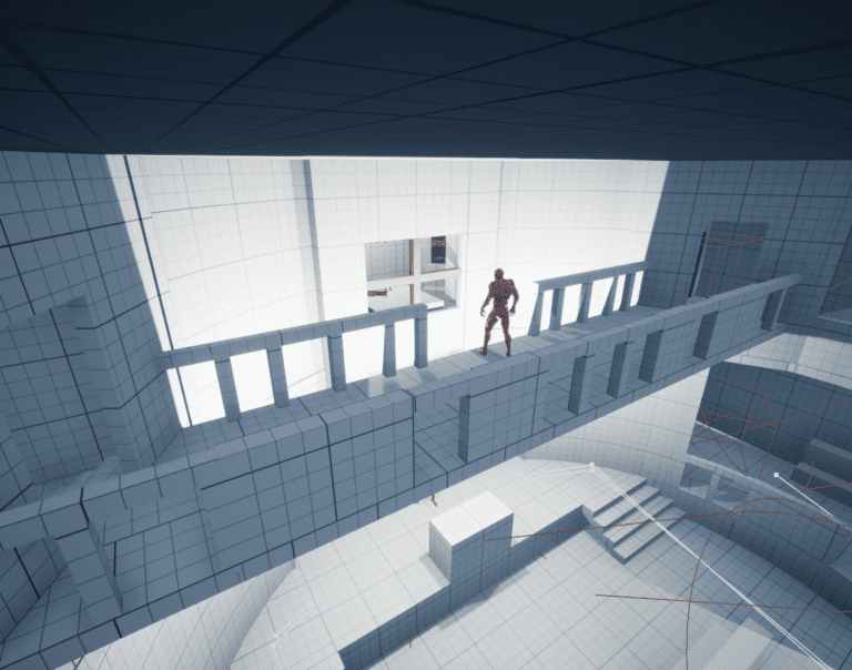
These included a catwalk, a basement dance room, and flags that direct the player towards the main office.
PHASE II - GREYBOX
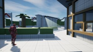
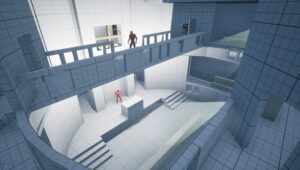
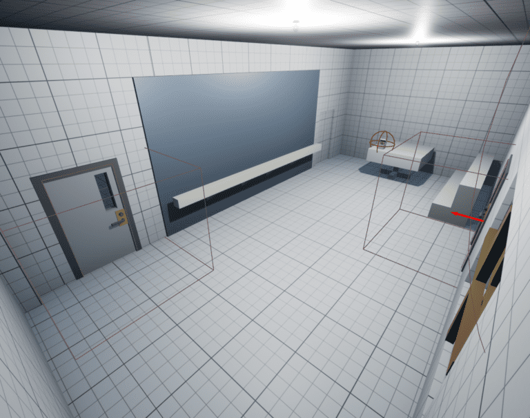
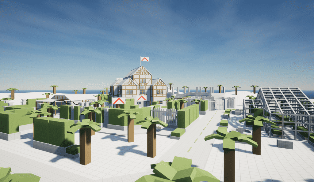
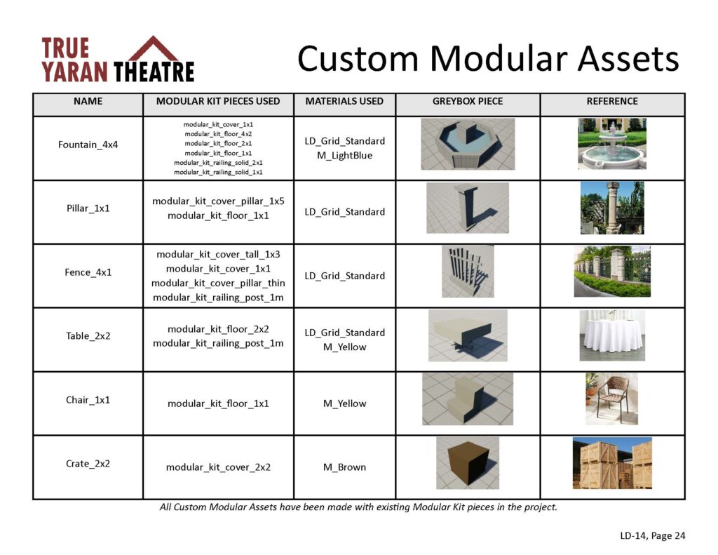
Phase II also required the creation of a Greybox. This Greybox was made within Unreal Engine 5, and a pre-made package was supplied with an included player controller, modular kit pieces, and gameplay objects.
BUILDING HEIGHTS AND VERTICALITY
As I constructed the level in 3D, the importance of building heights became more apparent.
The theatre was made almost twice as tall as any other surrounding structure, guiding the player towards it. Hedges, trees, and fences were also kept roughly at the same height, creating new paths the player could take if they found a way on top.
PHASE II TAKE AWAYS
Greyboxing my level showed the importance of vertical paths in levels. They’re easy to ignore in a top-down map early on in development, but if you plan them well, they can create more interesting paths for the player and use a level’s space more efficiently.

