Fantasy Weapon Select
Team: Solo Project
Role: 3D Artist, Programmer, UI Designer
Timeline: 3 Months
DESCRIPTION
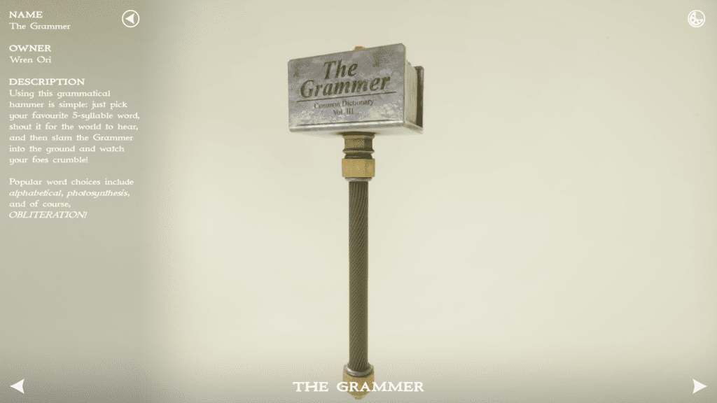
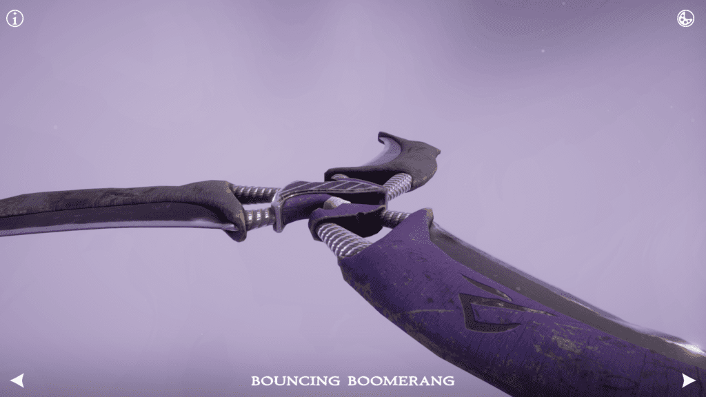
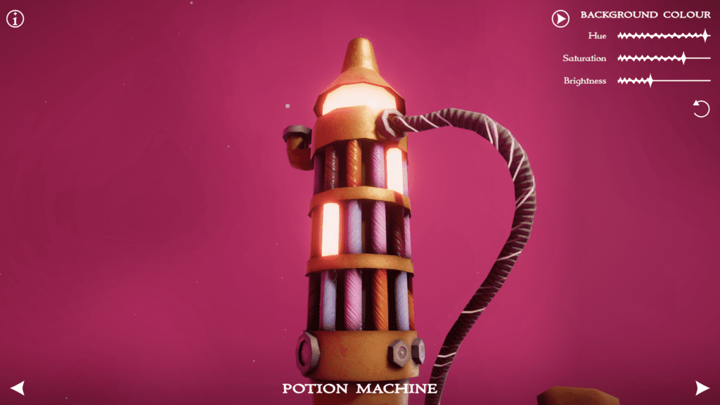
Fantasy Weapon Select was a personal project I created to further develop my 3D asset creation and UI design skills. It also gave me a chance to work with visual styles I was less familiar with. The project imitates the style of a weapon select screen, letting you inspect and read the stories behind a small selection of fantasy weapons, as well as letting you adjust their background and lighting.
TOOLS
- Unity, C#
- Maya, Substance Painter
- Mixcraft, Audacity
JUMP TO SECTION
PROJECT SHOWCASE
You can also try Fantasy Weapon Select on any Windows machine by downloading it from itch.io:
GAME ART
3D MODELS
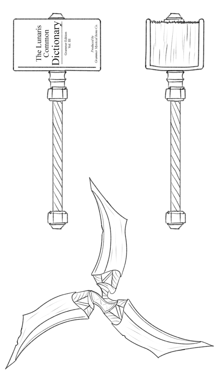
When designing the weapon assets, I first created a sketch of each model to get an accurate idea of the design beforehand. This saved time by reducing changes that would need to be made later on.
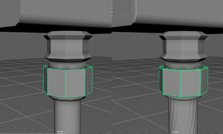
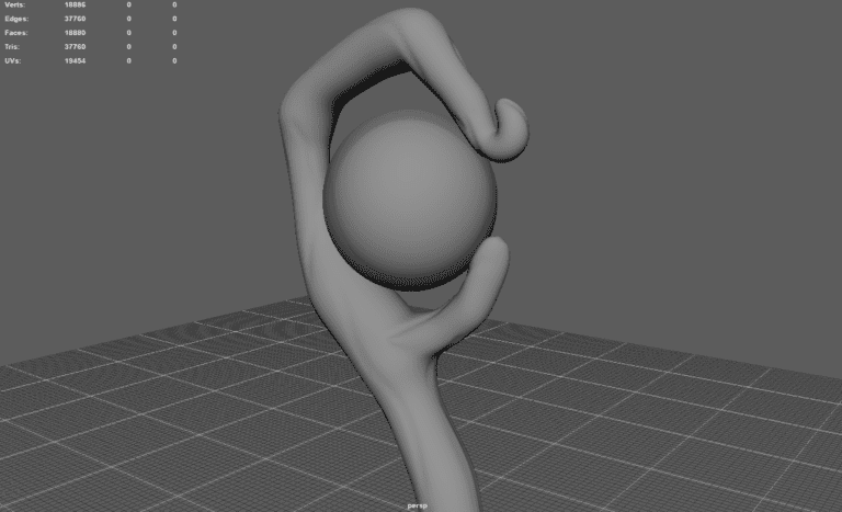
I then used Maya to create the models themselves. On some weapon edges, I wanted to add a soft bevel while preserving a low polygon count, so I created a high LOD version of each model. I then used this to bake normal maps onto the low LOD versions, which gave me a gradient of edge styles versus the standard two “hard” and “soft” edge options.
Using a high LOD model for each weapon also allowed me to sculpt extra details, such as some of the wooden grains in the “Staff of Enren.”weapon.
TEXTURING AND SHADERS
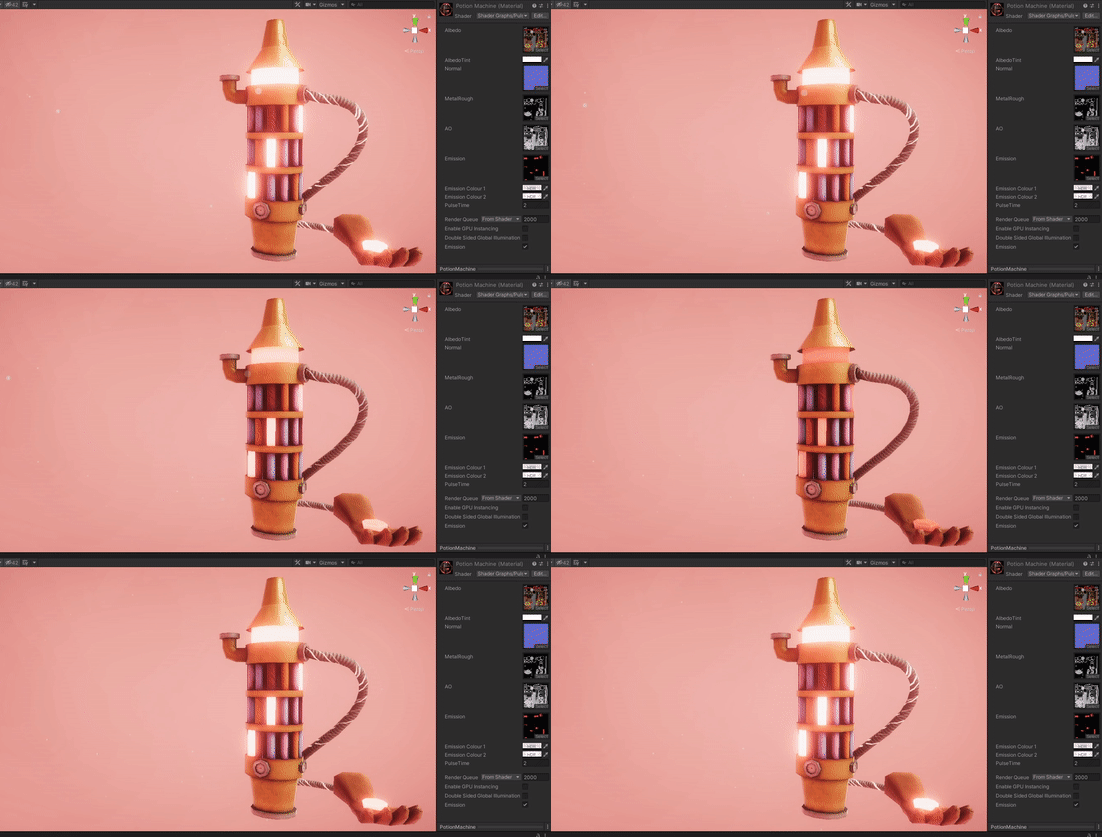
I wanted to experiment with a more realistic style when creating the weapons so I used Substance Painter to create the textures.To add some of the extra details such as the black paint in the crevices of “The Grammer” and the “Bouncing Boomerang” I used Anchor Points. This allowed me to reference normal maps as if they were geometry on the mesh, creating even more dynamic textures.I also wanted some weapons to glow so I created emissive textures to use in a custom Unity shader. The shader included the ability to fade the emission in and out, making the lights on the weapons feel more alive.
SPECIAL EFFECTS
I wanted the game’s presentation to enhance the weapons, so I added some special effects to add a final layer of polish.
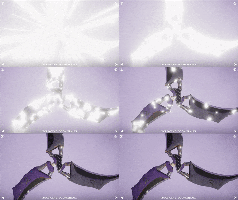
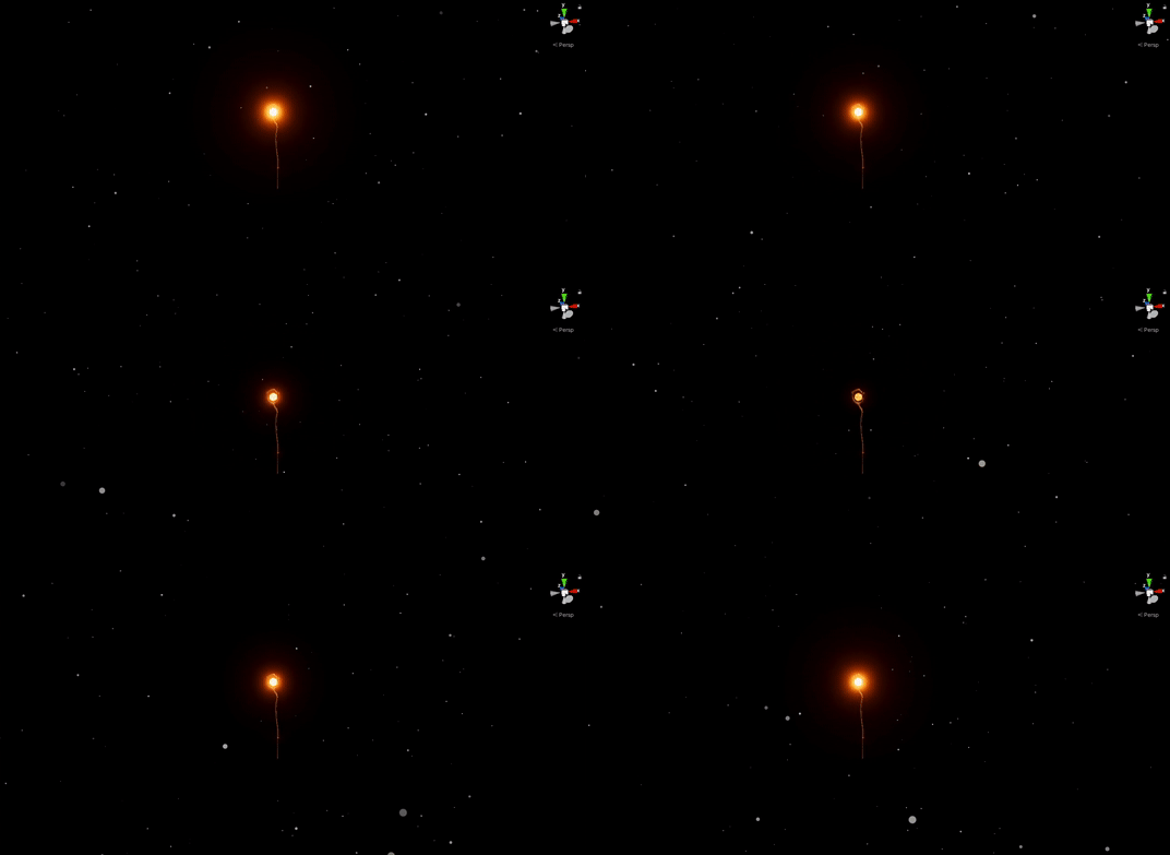
To make switching weapons feel impactful, I created a custom Unity Shader Graph that uses random noise to make the weapons “pop in” from a glowing white silhouette. I also added a glowing particle explosion to really sell the effect.
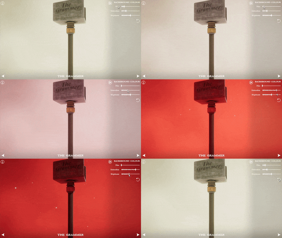
Using reflection probes I was able to make the background’s colour affect the ambient lighting of the weapon. This allows for a wide range of lighting styles when the player changes the background colour.
Finally, I added a subtle “dust” particle effect around the weapon to make the scene feel less static.
GAME ART TAKE AWAYS
This project showed me just how many steps go into making a high-quality 3D game model. I had done 3D modelling and texturing previously, however applying sculpting techniques and using multiple LODs of meshes was something I hadn’t done before. Additionally, my practice with in-game lighting and environment taught me just how much the presentation of a model can affect the appearance of the model itself.
SOUND DESIGN
MUSIC VARIATIONS
For this project, I wanted to add something more dynamic than add a single track to my weapon display.
Instead, I chose to change the instrument used for the melody of the song depending on the weapon shown.
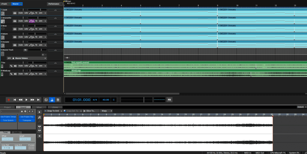
To do this, I created and exported separate audio files for each version of the song’s melody. I then created a C# script that played all versions simultaneously, but adjusted the volume of each so that only the selected weapon’s tune could be heard.
SOUND DESIGN TAKE AWAYS
I have always loved sound design in games, and this project showed me how being creative with music can enhance an experience. In future projects, I hope to add dynamic sounds and tunes similar to this so that the game audio matches the player’s experience
UI DESIGN
SUBTLETY
When making this project I designed the UI with the idea that less is more.
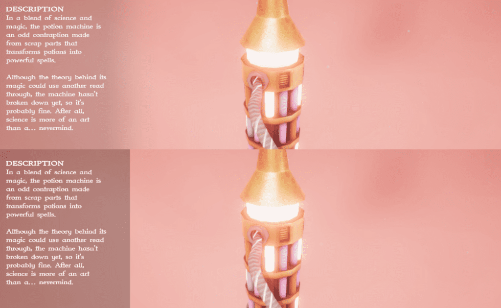
To accomplish this I avoided harsh boxes, instead opting for a subtle black gradient to highlight the UI’s text. I also made the UI automatically hide unless the player moves their mouse.
This way the UI only covers the screen when necessary, allowing for as much screen space as possible to be given to the weapon display.
MODULAR DESIGN
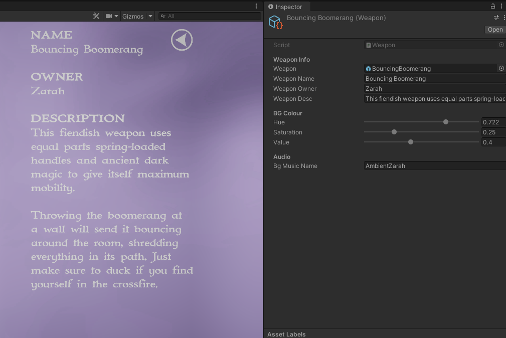
I designed this project as if it were a weapon selection screen for a game. Because of this, I made sure that weapon implementation was as modular as possible so that future weapons could be added with ease.
I created a Unity Scriptable Object that includes all information about each weapon including its model. The weapon’s info is then loaded by a game manager whenever the weapon is selected.
This way, new weapons can easily be added by dragging and dropping a model, and filling out the object as if it were a form.
UI DESIGN TAKE AWAYS
This was one of my first projects where I heavily considered UI design, and because of this, I learned a lot about good UI implementation practices. Often it can be used as a band-aid to fix a problem with gameplay, however if proper consideration is taken into its design and visual hierarchy, it can work alongside the game’s visuals, rather than fight against them.

